bins overflow. fines pile up. nobody knows who to call.
Fraternities and sororities frequently host events where bins overflow before city pickups — creating frustration, mess, and fines. Students relied on slow, outdated systems: city websites, phone calls, no confirmation. Responsibility was unclear, costs were unpredictable, and flexible scheduling was impossible for unpredictable college events.
"students rely on slow, outdated systems" — using city websites or phone calls without confirmation
opportunities
shared platform enables easier coordination between students, campus facilities, and waste haulers
scheduling tools and reminders prevent overflow and encourage proper disposal
flexible pricing and student-run crews make responsible waste management accessible
visible waste statistics reward cleanup efforts and build accountability
challenges
unpredictable costs varying by size, timing, and provider
service reliability dependent on trustworthy partners
regional policy and compliance variations across campuses
user responsibility and cooperation requirements
competitive analysis
nothing out there was built for students.
No existing apps were designed specifically for fraternity or sorority waste management. Students relied on city pickup forms and difficult dumpster rental processes. Every competitor was outdated, homeowner-focused, and confusing on mobile — leaving a clear gap for a student-first solution.
gap identified
no apps built specifically for greek life or student organizations — a completely underserved market
existing tools
students rely on city pickup forms or private hauler calls — both slow, confusing, and designed for homeowners
competitor weakness
every competitor was outdated, mobile-unfriendly, and required multiple calls with no instant confirmation
opportunity
greek clean positioned as simple, student-focused alternative with clear pricing and quick on-demand scheduling
research
six interviews. sixty-four survey responses. two days.
Conducted six in-depth interviews plus a Google Forms survey across UT Austin fraternities and sororities. The survey received 64 responses within two days — validating the problem quickly and surfacing clear patterns in how students experience post-party waste.
6
in-depth interviews
64
survey responses
2
days to collect data
key findings
overflowing bins represent the biggest post-party problem — students had no reliable way to address it quickly
cost significantly influences cleanup decisions — students needed upfront pricing before committing
unclear responsibility creates delays and frustration — no single person owned the cleanup process
flexible scheduling was needed — event times are unpredictable and city pickup schedules don't match
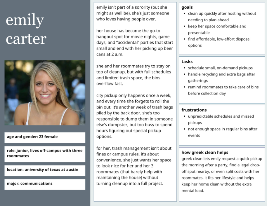
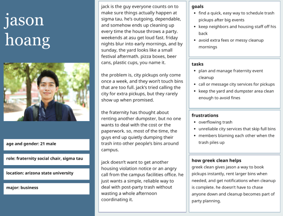
two main personas emerged: the event organizer (proactive, stressed about fines) and the casual member (reactive, unsure of their role)
knowing who you're designing for
two personas. one shared problem.
Research surfaced two distinct user types. Both deal with the same mess — but with very different motivations, stress levels, and expectations from a solution.
the event organizer
proactive · stressed about fines · owns the problem
plans ahead, takes responsibility, and dreads the post-party cleanup. needs fast, reliable scheduling with upfront pricing — and confirmation that someone is actually coming.
the casual member
reactive · unsure of their role · waits to be told
shows up when asked, doesn't know who handles trash logistics, and gets overwhelmed by anything that requires more than two taps. needs something obvious enough to use half-asleep.
journey
mapping the mess before cleaning it up
User journey mapping helped visualize the full experience — from recognizing a mess to final cleanup — focusing on emotional touchpoints and frustration areas. Three core flows were redesigned from scratch.
user journey — from mess to managed
01
event night
"cleanup can wait 'til tomorrow"
hosting party, filling all bins
no waste plan
02
the morning after
"there's trash everywhere — we'll get fined"
discovering overflowing bins
no immediate solution
03
searching
"this city form asks for a permit number?"
city sites, search engines, phone calls
designed for homeowners
04
on hold
"been on hold 20 min. still no idea what this costs"
multiple calls, zero confirmation
zero transparency
05
greek clean
"scheduled in 2 min — I can track them live"
books pickup, instant confirmation
simple, student-first
before → after
01 — hire a crew
before
multiple calls, confusing forms, days-long confirmation process with no live updates
after
open app, add details, receive instant estimate and confirmation with live crew updates
02 — rent a dumpster
before
multiple calls to private haulers, unclear pricing, expensive minimums, no transparency
after
select duration and size, see upfront pricing, book directly with instant confirmation
03 — find a bin
before
guess which bins are public or private, risk conflicts and fines with no information
after
map view shows legal nearby bins with live availability and status updates
information architecture
Five main navigation sections structured around the core jobs users needed to get done.
app IA
find a bin
location map
show nearest legal bins
filter by access type
real-time bin availability
directions to bin
report full or inaccessible bins
hire a crew
schedule pickup
upload photo of trash
select pickup time
choose crew type
confirm address + payment
live status updates
past pickups
view completion photos
download receipt
rate crew
rent a dumpster
choose size
select duration
view pricing breakdown
confirm drop-off time + location
request early pickup or extension
view rental history
user dashboard
upcoming pickups
countdown timers
status tracking
modify or cancel request
rental overview
active dumpster rentals
manage extensions or pickups
rewards + points
points earned
redeem options
eco-impact summary
cleanup history
receipts + photos
reorder or repeat cleanup
profile settings
campus affiliation
saved addresses
payment methods
support
faq
how pricing works
city rules + restrictions
recycling guidelines
troubleshooting missed pickups
contact support
live chat
submit request form
report issue
missed pickup
app bug
billing concern
design process
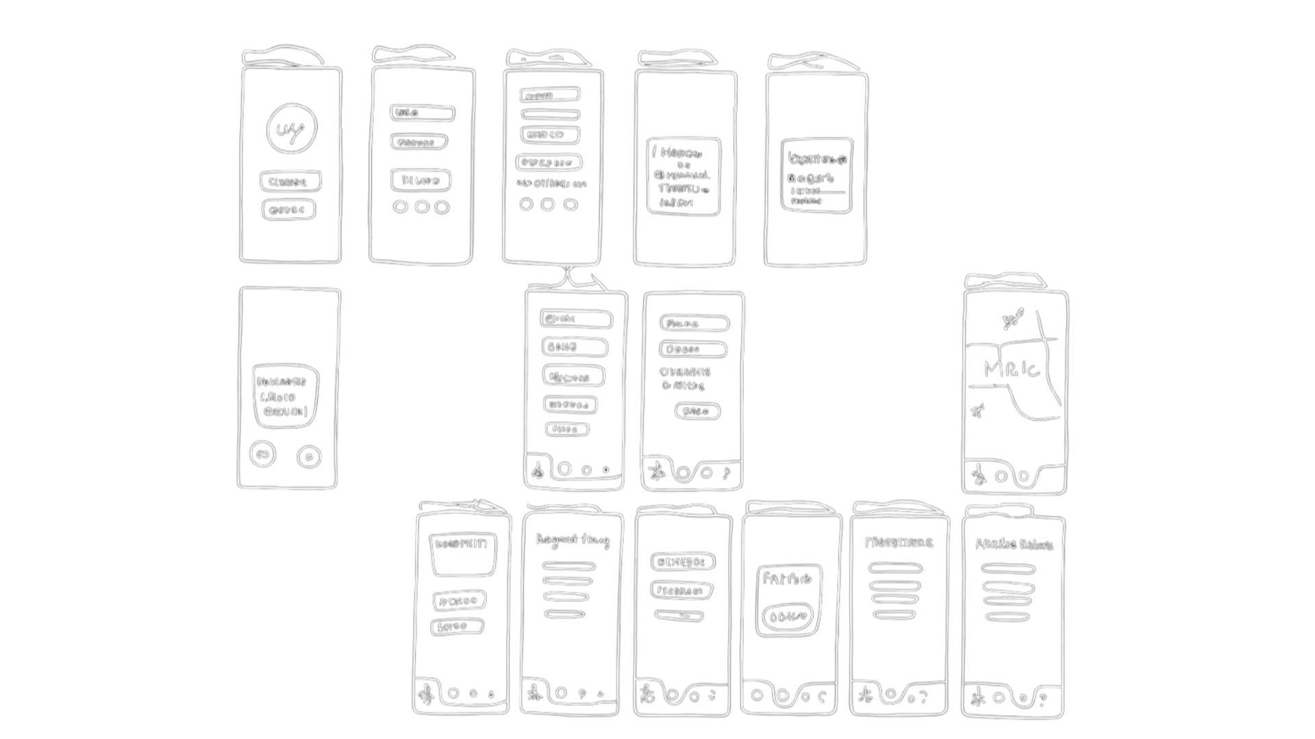
Low and mid-fidelity sketches explored layouts and navigation before moving to digital. Emphasis on clear progress indicators and large, tappable buttons. User feedback directly shaped confirmation screens and icon labeling.
phase_01 — wireframe sketches
mapping the flows on paper first
rough sketches established the core navigation structure and task flows before any pixels were touched. the goal was speed — test the logic, not the look.
phase_02 — mid-fidelity prototype
testing transitions and button placement
interactive prototypes in figma let real users navigate the three core tasks. feedback from these sessions directly reshaped confirmation screens, icon labeling, and price visibility.
phase_03 — final design
three ways to handle waste, one clear system
the final screens distilled every research insight and usability fix into a focused, task-driven interface — clean enough for a stressed-out student, clear enough for anyone.
01 — hire a crew
schedule a team to handle the heavy lifting
02 — rent a dumpster
book a dumpster for large-scale cleanouts
03 — find a bin
quick drop-off points near you
key takeaways
what i walked away with
01
simple wins on campuses. clarity always beats complexity — especially when users are stressed, rushed, or dealing with a mess at 2am.
02
progress feedback builds trust. showing users where they are in a flow gives them peace of mind and reduces drop-off significantly.
03
labels matter more than icons. icon-only navigation consistently confused users — adding text labels removed friction immediately.
04
rough prototypes reveal more truth. low-fidelity sessions uncovered issues that polished mockups had hidden behind visual appeal.
05
empathy is the best design tool. real conversations with students drove every meaningful design decision in this project.
06
confusion is more valuable than praise. the moments where users got stuck gave me more to work with than any positive feedback.